Amy’s Soups Rebrand
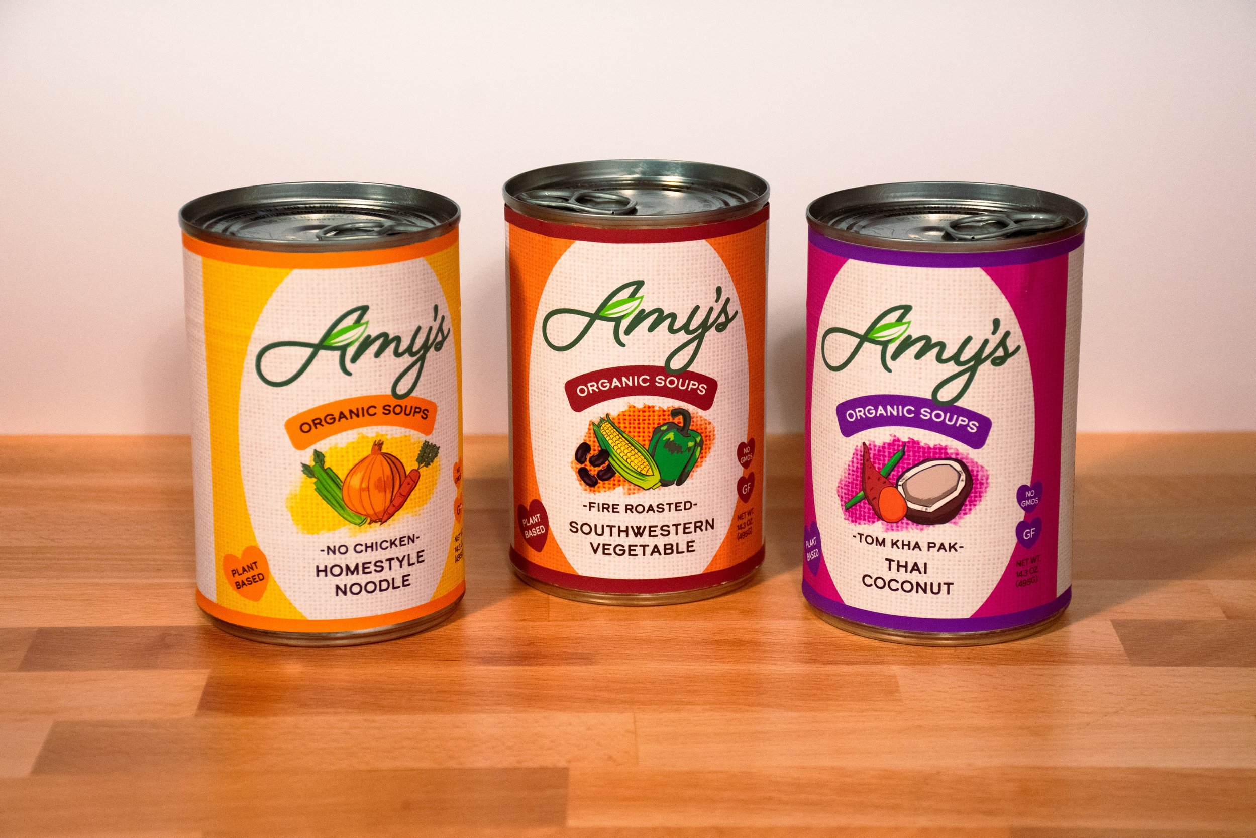
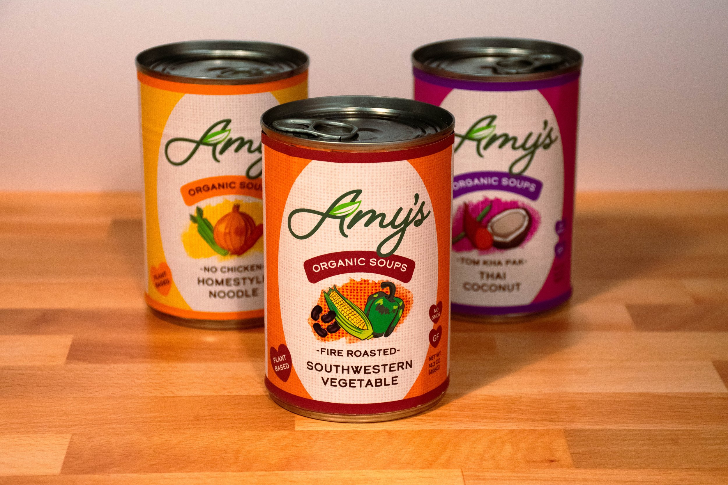
I wanted to refresh the Amy’s brand as an organic, vegetarian option. I created a new logo and three soup labels using realistic vegetable illustrations reflecting the ingredients in the soup. I used a burlap texture and a gritty font to emphasize the product being organic, and pops of color on the beige backgrounds based on each soup flavor.


As a frequent buyer of Amy’s products, I’ve always thought that their branding could use a refresh. In my opinion, the design of the can focuses on a large product shot and the word “Soups”, along with dull colors, that do not speak to the freshness of the ingredients Amy’s uses. Their soups are often overshadowed by brands with flashier packaging, despite being a less-processed (and tasty!) option for vegetarians like me.
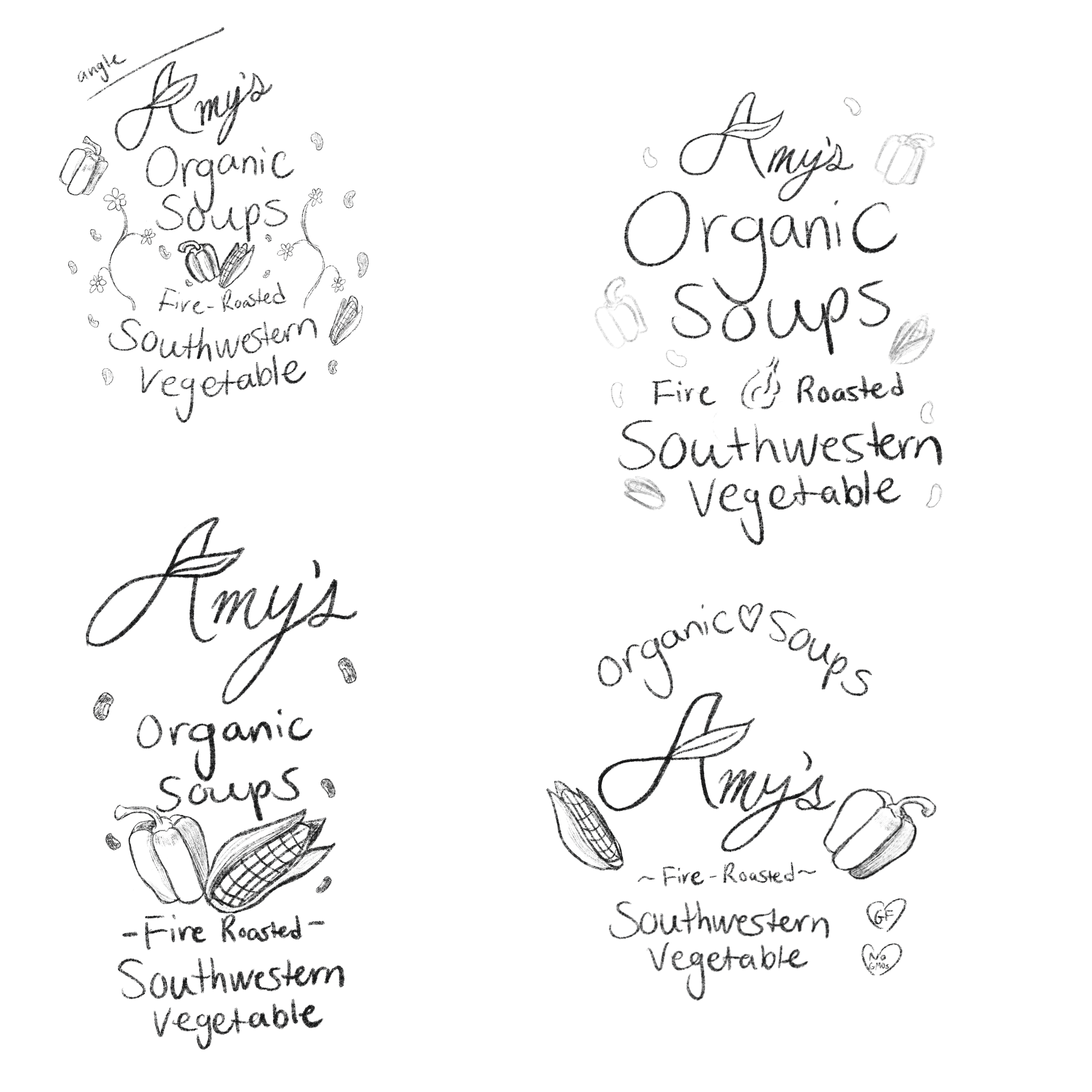
I sketched a new logo based on the original script typography used, focusing on the “made with love” concept that Amy’s stands for. I then started to lay out new labels, using illustrated vegatables and curving lines.

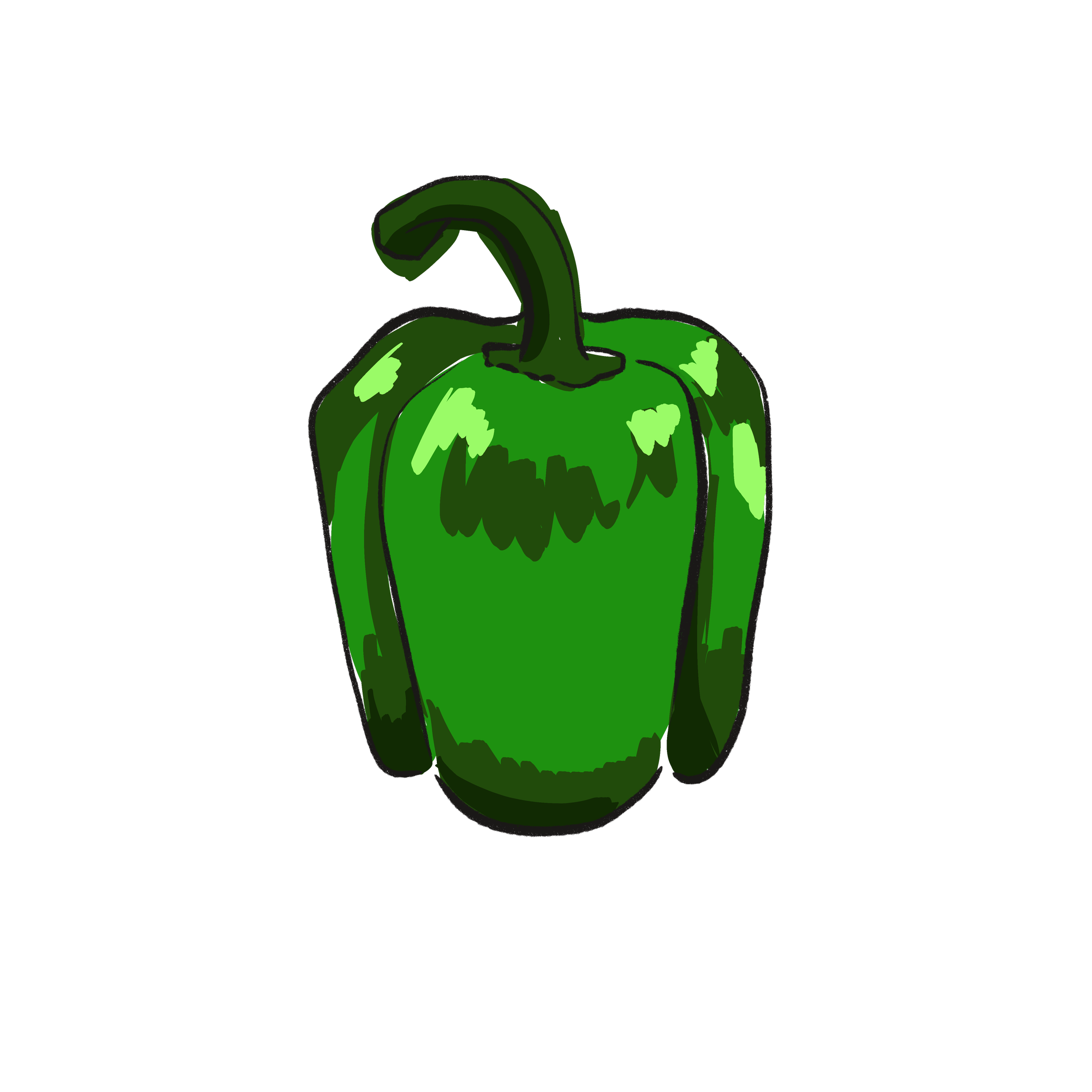


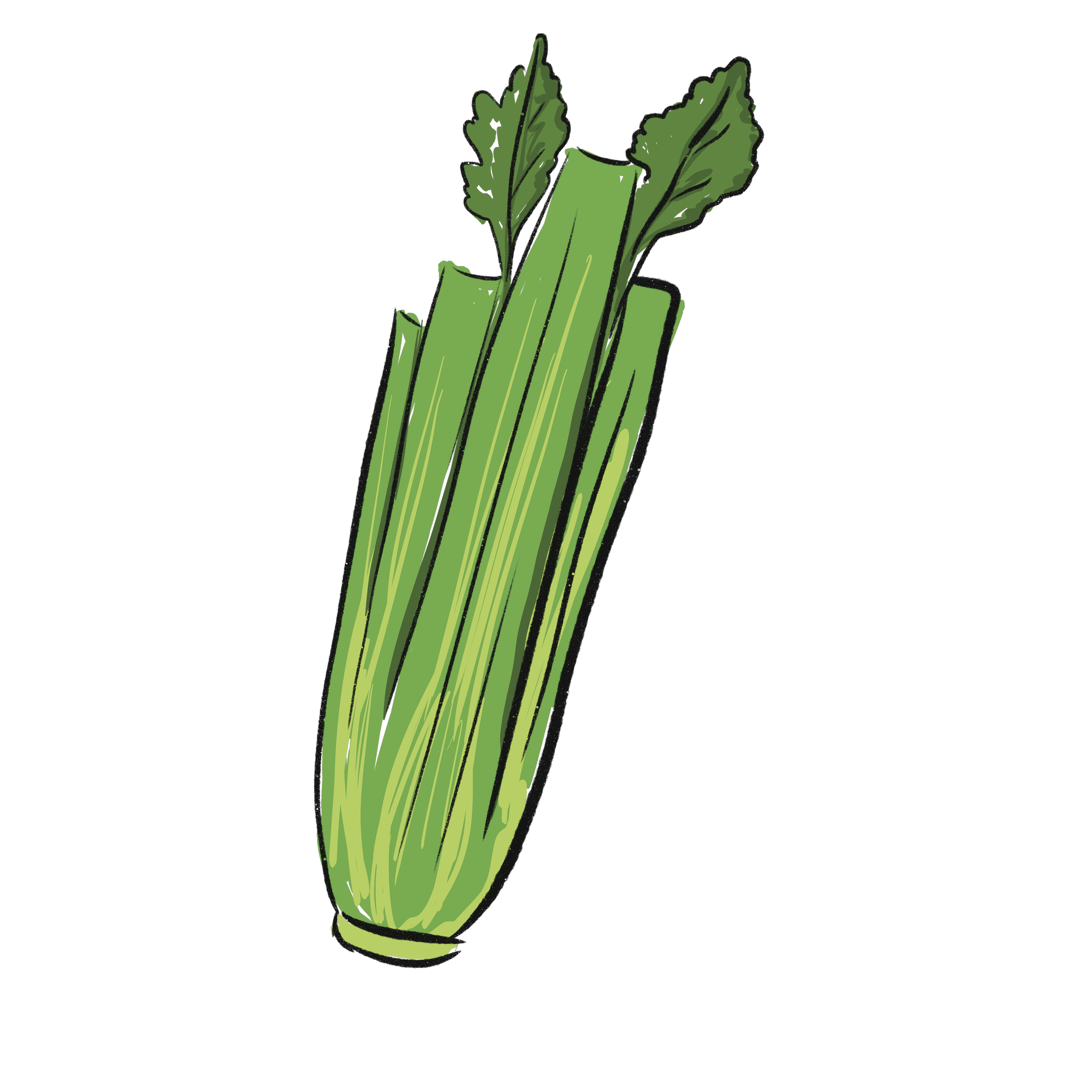


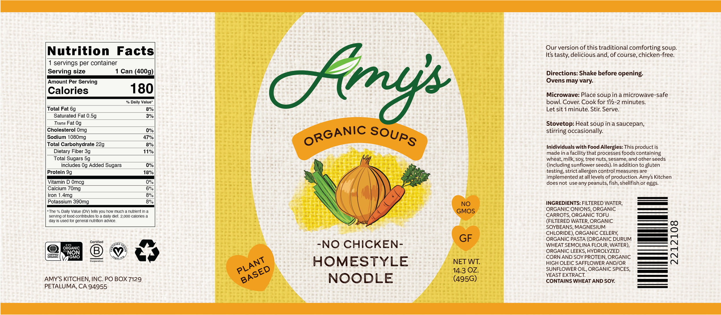


I used a burlap texture along with loosely colored in illustrations to create a rustic, homestyle feel. I chose two main accent colors for each label that reflected their flavors.